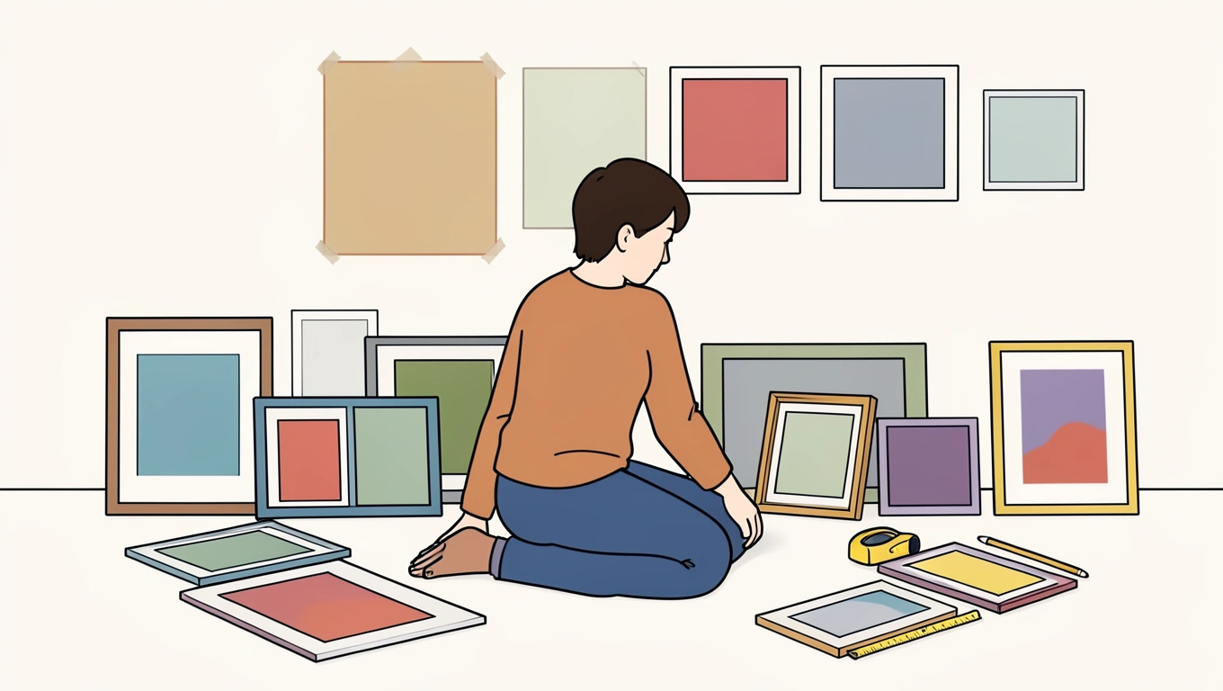
A bare wall is an invitation. It's also a little intimidating - especially when you're staring at it with a stack of frames leaning against the baseboard and no clear plan. Creating a gallery wall at home isn't about following a rigid formula or achieving magazine-perfect symmetry. It's about turning a collection of prints, photos, and objects into something that feels intentional and personal. The difference between a wall that looks thoughtfully curated and one that feels random comes down to a few key decisions about spacing, balance, and cohesion. Once you understand these principles, you can arrange anything from family photos to abstract prints in a way that actually works.
Start With Layout Planning Before You Pick Up a Hammer
The biggest mistake people make is hanging the first frame and then trying to build around it. You end up with uneven spacing, awkward gaps, and a composition that tilts visually to one side. Before anything goes on the wall, you need to see the full arrangement from above.
Lay all your pieces on the floor in roughly the same footprint you want on the wall. This gives you a bird's-eye view of how shapes, sizes, and colors interact. Move things around. Swap a vertical frame for a horizontal one. Slide that oversized print to the center or push it to one edge. You'll start to see patterns emerge - where the eye naturally lands, where there's too much visual weight on one side, where a gap feels intentional versus awkward.
Start with your largest pieces first and arrange smaller frames around them. Large artwork acts as an anchor. It gives the composition structure and prevents the wall from looking like a scattered collection of small rectangles. Once the big pieces are placed, fill in with medium and small frames, leaving roughly 2 to 3 inches of space between each piece. Closer spacing makes the collection feel cohesive, like one unified installation rather than individual items that happen to share a wall.
When you've got an arrangement that works, take a photo from directly above. Use painter's tape on the floor to mark the outer edges. Then trace each frame on kraft paper, cut out the templates, and tape them to the wall in the same layout. This lets you adjust placement, check the overall shape, and mark nail holes without committing prematurely.
💡 Pro Tip: Aim for the center of your entire gallery wall to sit around 60 inches from the floor - that's the standard eye-level height used in museums. Measure from the floor to that point, then work outward so the composition feels balanced when you're standing in the room.
Mix Frames and Art Styles Without Losing Cohesion
Eclectic doesn't mean chaotic. You can mix black frames with wood tones, combine vintage prints with modern photography, and throw in a few three-dimensional objects without the wall looking like a yard sale. The key is choosing one unifying element that ties everything together.
That element could be a color palette. Maybe every piece includes a shade of blue, or all the frames share warm wood tones. It could be a theme - all botanical prints, all black-and-white photography, all abstract shapes. It could even be a consistent mat color or frame width. When you have that thread running through the collection, individual pieces can be wildly different and still feel like they belong together.
Don't be afraid to mix frame orientations and sizes. A wall of identically sized square frames in a perfect grid can look stiff. Varying the shapes - portrait, landscape, square - creates movement and keeps the eye traveling across the wall. Pair a large vertical print with a cluster of smaller horizontal frames. Balance an oversized canvas on one side with several smaller pieces grouped tightly on the other.
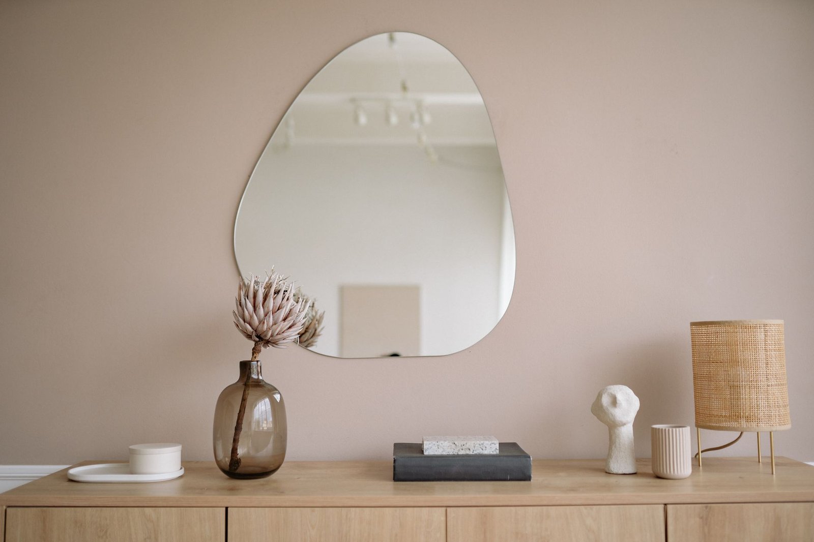
Beyond traditional framed art, consider incorporating mirrors, woven textiles, decorative plates, or small shelves. These objects add dimension and texture. A round mirror among rectangular frames breaks up the geometry. A small woven wall hanging introduces softness. Just keep the unifying element in mind - if your frames are all matte black, maybe the mirror has a black frame too, or the textile includes black thread.
💡 Pro Tip: If you're mixing gold, silver, and wood frames, keep the finish consistent within each metal type. All your gold should be the same tone - either warm antique or cool brushed, not both - or the wall will feel disjointed even with a cohesive art theme.
Treat the Whole Wall as a Single Piece of Art
Once you step back, the individual frames should blur into one cohesive shape. That shape can be organic and asymmetrical, or it can follow a tighter geometric grid. Either approach works as long as the overall silhouette feels deliberate.
For an organic layout, think about the negative space - the wall showing between and around the frames. Too much empty space in one area makes the collection feel unbalanced. Try to keep the visual weight distributed so no single corner dominates. If you've got a large piece on the left, balance it with a cluster of smaller frames on the right, not another large piece that creates symmetry but rather a grouping that equals the visual mass.
For a grid layout, establish a baseline or center line and work from there. You might align all the top edges, or align the center line horizontally so frames above and below mirror each other. Grids are more forgiving when frames are similar sizes, but you can still vary dimensions by treating multiple small frames as one unit occupying the same space as a larger frame.
Step back frequently while you're arranging paper templates or while you're hanging the actual pieces. Walk to the other side of the room. Sit on the couch. Stand in the doorway. The composition should feel balanced from every angle where you'll actually spend time looking at it. If one side feels heavy, redistribute - move a bold, high-contrast piece toward the center, or add another small frame to the lighter side.
Hang With Precision and Flexibility
You've planned the layout, you've got your paper templates up, and now it's time to actually hang the frames. Use a level for each piece. Even a slight tilt becomes glaring when you've got ten frames on the wall and one is crooked.
For the actual hanging hardware, match it to the frame weight. Picture hanging strips work for lightweight frames on drywall, but anything over a few pounds needs a proper wall anchor or a stud. Check the frame's hanging mechanism - is it a sawtooth hanger, D-rings, or wire? Each requires a slightly different approach to get the frame sitting flush and level.
Start with the center or anchor piece and work outward. If you've planned everything correctly with templates, you'll know exactly where each nail goes. But leave a little room for adjustment. Sometimes a frame looks different on the wall than it did on the floor because of lighting or the way the art reads vertically. If something feels off, move it before you commit to hammering fifteen more nails.
Once everything is up, stand back again. Look for gaps that feel too wide or too narrow. If the spacing is inconsistent, it'll nag at you every time you walk past. Tighten up any frames that are drifting apart, and don't be afraid to pull one down and shift it a half-inch if it improves the overall composition.
Conclusion
Creating a gallery wall isn't a one-afternoon project if you want it done right. The planning phase - laying out frames on the floor, cutting paper templates, checking balance - takes longer than the actual hanging. But that's where the real work happens. Once you've dialed in the spacing, chosen a unifying element, and treated the collection as one cohesive piece, the physical installation is just execution.
The best gallery walls evolve over time. You'll swap out a print, add a new frame, shift things around when you move furniture. But the foundational principles stay the same: keep spacing consistent, anchor the composition with larger pieces, and maintain that thread of cohesion whether it's color, theme, or style. When it works, the wall stops being a collection of individual frames and becomes one deliberate, personal statement that actually improves the room.
FAQs
Should all frames in a gallery wall be the same color?
No, but they should share a common thread. You can mix frame colors as long as there's a unifying element elsewhere - maybe all the artwork shares a color palette, or all the frames are wood tones even if they range from light oak to dark walnut. Mixing black, white, and wood frames can work if the art inside follows a consistent theme or style. The goal is cohesion, not uniformity.
How do I hang a gallery wall on a textured or plaster wall?
Textured walls require wall anchors for anything beyond the lightest frames. Plastic anchors or toggle bolts distribute weight better than nails alone. Pre-drill pilot holes slightly smaller than the anchor diameter to avoid cracking the plaster. For renters or those avoiding holes, adhesive strips rated for the frame's weight can work on some textured surfaces, but test one in an inconspicuous spot first since texture can reduce adhesion.
Can I add to a gallery wall over time, or should I plan the whole thing at once?
You can absolutely add pieces gradually, but leave space for future additions when you do the initial layout. If you pack frames tightly edge-to-edge, there's nowhere for new pieces to go without redoing the entire wall. Leave strategic gaps or plan an asymmetrical shape that can expand in one direction. Some people start with half the wall and fill in over months as they find new art.
What's the best way to light a gallery wall?
Picture lights mounted above individual frames work for traditional galleries, but in a home they can feel fussy. Track lighting or adjustable ceiling-mounted spotlights give you more flexibility to highlight the entire wall without multiple fixtures. Aim the light at a 30-degree angle from about 3 feet away to minimize glare on glass-covered frames. Avoid lighting from directly below, which creates odd shadows.
How many pieces do I need for a gallery wall to look complete?
There's no magic number, but fewer than five pieces usually reads as a small grouping rather than a full gallery wall. Most successful gallery walls have between seven and fifteen pieces, though it depends on frame sizes and wall dimensions. A small wall over a console table might look complete with five medium frames, while a large living room wall could hold twenty without feeling crowded. Focus on filling the planned footprint rather than hitting a specific count.